Mapping West Virginia's tornado tracks
Every surveyed tornado in Ohio and West Virginia since 2014, the July 2026 outbreak near my home county, and all 74,771 US tornadoes back to 1950.
On July 21, 2026, a tornado outbreak moved along the Ohio River. By the end of the day the National Weather Service would survey fifteen tornadoes across Ohio and West Virginia, part of a larger multi-state outbreak. Nine of them touched West Virginia, which is not a sentence you get to write often.
Six tornadoes touched down inside the state: an EF2 in Ritchie County, an EF1 in Randolph, two in Pendleton, and one each in Barbour and Hampshire. Three more, including the two strongest of the day, touched down across the river in Washington County, Ohio and crossed into Pleasants and Doddridge counties. Two of those reached EF2 with surveyed peak winds of 120 and 130 mph, and one stayed on the ground for 24 miles. They wrapped around Harrison County, where I live: Doddridge to the west, Ritchie and Pleasants to the northwest, Barbour to the south. None came through the middle.
I pulled every surveyed tornado track the Weather Service has for the two states and put them on a map you can zoom into.
Each line is a surveyed damage path, colored by EF rating. Click a track for the surveyed peak wind and impact. The controls beside the map (below it on a phone) filter by time and EF rating and shade counties by count or peak wind.
The default view is July 21, 2026, centered on my corner of the state. Switch the time filter to 2024 or to all years and the map re-frames to the whole region, where a very different picture shows up.
Full list of the July 21, 2026 tornadoes (text version of the map)
| Tornado | Touchdown | EF | Peak wind | Path (mi) | Notes |
|---|---|---|---|---|---|
| Washington to Pleasants #2 | Washington County, OH | EF2 | 130 mph | 12.1 | Crossed the Ohio River into WV |
| Washington to Pleasants #1 | Washington County, OH | EF2 | 120 mph | 12.2 | Crossed the Ohio River into WV |
| SE Ritchie Co | Ritchie County, WV | EF2 | 115 mph | 1.8 | |
| Washington to Doddridge | Washington County, OH | EF1 | 110 mph | 24.3 | Crossed the Ohio River into WV |
| High View WV | Hampshire County, WV | EF1 | 110 mph | 3.3 | |
| Zane1 | Muskingum County, OH | EF1 | 105 mph | 8.7 | |
| Kiser Gap WV | Pendleton County, WV | EF1 | 100 mph | 10.4 | |
| Gandy Survey | Randolph County, WV | EF1 | 95 mph | 0.9 | |
| Amelia OH | Clermont County, OH | EF1 | 90 mph | 4.9 | |
| Barbour Co | Barbour County, WV | EF0 | 85 mph | 0.3 | |
| Youngstown Tornado | Trumbull County, OH | EF0 | 85 mph | 6.2 | |
| Seneca Rocks WV Tornado | Pendleton County, WV | EF0 | 80 mph | 0.2 | |
| Zane2 | Muskingum County, OH | EF0 | 75 mph | 15.8 | |
| Lees Creek OH | Clinton County, OH | EF0 | 75 mph | 3.4 | |
| Feesburg OH | Brown County, OH | EF0 | 75 mph | 1.7 |
A state that is not tornado country
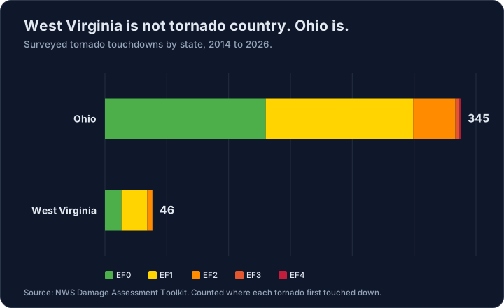
West Virginia genuinely is not tornado country, and the record says so plainly. Since 2014 the Weather Service has surveyed 46 tornado touchdowns in West Virginia and 345 in Ohio. The mountains are the reason. The same terrain that makes the state beautiful tends to break up the organized, rotating storms that drop tornadoes, while Ohio's flatter interior gives them room to form.
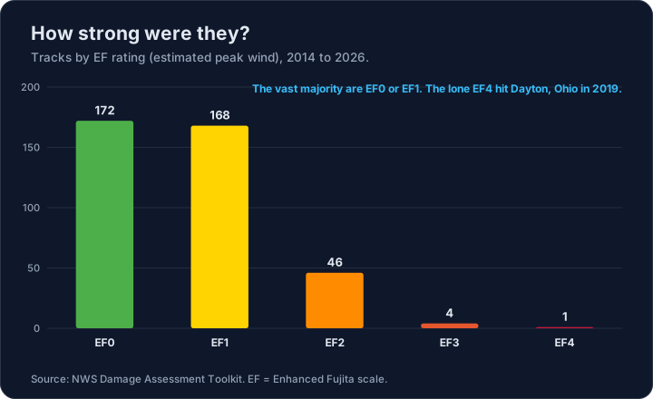
They also tend to be weak. The vast majority of tornadoes in the record are an EF0 or an EF1. The two states have recorded exactly one EF4 across the whole 2014 to 2026 record, and it was in Ohio: the 2019 Dayton tornado.
2024 set the record
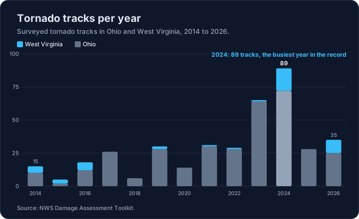
2024 was the busiest year in the survey record for the two states: 89 surveyed tracks, well past the next-highest year at 65. Seventeen of those were in West Virginia. A single active year is not a trend, but it is the kind of number worth watching.
How do you count a tornado?
This is where a habit of mine kicks in: I pay attention to what a number's definition is quietly doing. July 21 is a small case study in why that matters.
Count the tornadoes that touched West Virginia that day and you can defensibly say six, or nine. Six touched down inside the state. But the two most powerful, the pair that reached EF2 as they crossed into Pleasants County, sit in the official record as Ohio tornadoes, because Ohio is where they first reached the ground before crossing the river. Neither count is wrong. They answer different questions: where did it start, versus where did it do harm.
I built the map to count the standard way, by touchdown, which is how the Weather Service tallies them. A touchdown count quietly undersells West Virginia, though, so every crossing tornado says so in its popup: "Crossed the Ohio River." The definition is on the surface instead of buried under it.
Verified is not the same as preliminary
The same care applies to how finished the data is. Every track on this map is a completed, quality-controlled survey result. That is worth saying out loud, because in the day or two after a storm the fast numbers come from somewhere else: preliminary spotter reports that have not been surveyed yet. They are useful for a same-day answer, and they get revised. A finished survey and a preliminary report are two different levels of certainty, and a map that blurs them tells a cleaner story than the data supports. This one shows only the surveyed side.
The whole country, back to 1950
Two states and a decade of surveys is a narrow window. The map below is the other extreme: every tornado in the national record, 74,771 of them, from 1950 through this year, with a year slider so you can watch the record fill in.
Every tornado in the Storm Prediction Center database, 1950 to 2026. Finalized through 2025; 2026 is preliminary and draws as hollow rings. Drag the year slider to filter the record, and the rating checkboxes to isolate the strong ones.
It is a different data source, and the difference matters:
- The Ohio and West Virginia map above draws surveyed damage paths from the Damage Assessment Toolkit, which is why those tracks curve.
- This one draws the Storm Prediction Center database, which stores a begin point and an end point per tornado. Every track here is a straight segment between two points, not a surveyed path. About 26,000 of the records have no end point recorded at all, so they render as single points.
- The national map carries two levels of certainty, and says which is which. Through 2025 it is the finalized database: surveyed, rated, quality-controlled. 2026 is not in that database yet, because a tornado only enters it once its survey is finished, and that runs months behind. So the current year is drawn from SPC's preliminary reports instead, as hollow rings labeled Preliminary. There are 1,313 of them so far.
The trap in this data
The count of recorded tornadoes climbs steeply across the record. It is tempting to read that as tornadoes becoming more common. It is mostly not:
- 1950: 201 tornadoes recorded, and 99 of them were rated F2 or stronger. Nearly half.
- 2011: 1,704 recorded, and 283 of them were F2 or stronger. About one in six.
Tornadoes did not get weaker. Detection got better. In 1950 a violent tornado that tore through a town got written down and a brief EF0 over empty pasture did not, so the early record is skewed toward the strong ones that were impossible to miss. Spotter networks, then Doppler radar, then a phone camera in every pocket filled in the weak tail that was always there. The strong-tornado series is the one to read for anything resembling a trend, and the map says so on the page rather than leaving you to work it out.
Two more things the data will not tell you unless you ask:
- Ratings changed scale. Anything before February 2007 is Fujita (F), after it is Enhanced Fujita (EF). Both are stored as 0 to 5 in the same column. Related, not identical, and ratings before 1973 were assigned retroactively from damage records.
- An unknown rating is not a zero. 1,546 records carry a magnitude of -9, which means nobody rated it. Bucketing those into EF0 is an easy way to invent 1,546 weak tornadoes that were never actually weak.
Preliminary is a different thing, so it looks different
The temptation with a gap at the end of a time series is to paper over it. The better move is to fill it and label it, because the two sources really are different and the difference is the interesting part:
- A preliminary report is one point, not a track. Nobody has walked the damage path yet.
- It has no rating. Every preliminary row carries the literal value "UNK": 1,313 of 1,313. The comments often mention a rating, but that is a forecaster's narrative, not the assigned one, so the map does not parse a number out of prose it would then present as data.
- It has no casualty figures, which is why clicking one shows a note rather than a row of zeros. Zero and not-yet-counted are not the same number.
- The counts move in both directions. Surveys merge several reports into one long-track tornado, and remove reports that turn out to be straight-line wind.
So preliminary reports sit outside the rating filter and outside the fatality total, and they are drawn hollow in a color that is deliberately not on the F/EF ramp. You can switch them off. The point of putting them on the map is not to inflate the count, it is that a map which quietly stops eight months ago is worse than one that shows you the edge of what is known.
The counting question, again
The commonly repeated way to deduplicate this file is to keep only the rows where the state-number column equals one, on the theory that a tornado crossing a state line is stored twice. I checked before trusting it, and it is wrong for this file. Every row already carries a segment number of one, meaning the file ships collapsed to one row per tornado, and applying the filter anyway would silently drop 670 real records.
The build script re-runs that check on every refresh and writes the result into the summary file the map loads, so it is not a claim you have to take my word for. One more habit from the same family: SPC revises the historical database as surveys are finalized, so annual counts shift a little between file vintages. 2011 reads 1,691 tornadoes in the 2024 file and 1,704 in the 2025 one. That is why nothing on this page hardcodes an annual total as a published fact.
How it's built
The whole thing is static. A Python script queries the Damage Assessment Toolkit for the damage-line features inside an Ohio and West Virginia bounding box, snaps each track to the county it started in with a point-in-polygon test (which also drops the tornadoes that merely clipped a neighboring state), and writes GeoJSON. A single self-contained MapLibre GL page draws the tracks over Esri's satellite imagery, with county outlines from the US Census and town labels from Natural Earth. No backend, no build step, no API key. The extraction and chart scripts live next to the map if you want to see the pipeline or refresh the data.
The path geometry is the part worth getting right.
- Watch out: the obvious source, NOAA's Storm Events database, records only a start point and an end point for each tornado, so a path drawn from it is a straight line between two dots. That is fine for a state-level overview and wrong the moment you zoom in, because real tornadoes do not travel in straight lines.
The curved tracks here come from the NWS Damage Assessment Toolkit, where survey teams record the actual damage path and the peak wind they estimate from it.
Key takeaways
- West Virginia is not tornado country. Since 2014 the Weather Service has surveyed 46 touchdowns there against 345 in Ohio, and the mountains break up the rotating storms that drop tornadoes.
- Most tornadoes in the record are weak. The vast majority are EF0 or EF1, and the only EF4 across the 2014 to 2026 record was the 2019 Dayton tornado in Ohio.
- 2024 set the record with 89 surveyed tracks, well past the next-highest year at 65.
- How you count changes the answer. July 21 was six or nine West Virginia tornadoes depending on whether you ask where they touched down or where they did harm, so the map counts by touchdown (the Weather Service standard) and labels every river crossing.
- The map shows only finished, quality-controlled surveys, not preliminary spotter reports, and the curved tracks come from the Damage Assessment Toolkit, not the straight lines you would draw from Storm Events' start and end points.
What I'd add next
A few things I would build if I kept going:
- The preliminary spotter reports as a second, visually distinct layer, so the map shows certainty as well as geography.
- An animated version that plays each track in the order it happened during an outbreak like July 21.
Mostly, though, this was a way to work real geospatial data end to end, from a government API to a map you can actually explore, and that part I would do again.